Overview
Wise Music is a responsive program for creatives by creatives, the main focus is on royalty-free downloadable tracks for users. As both a long-term Musician and Paralegal, I was actually really excited when I came across an opportunity to redesign a music licensing app like this.
Why don’t we take a closer look?
UI Design (Branding, Color, Typography, Logo, Interaction, Wireframing, Prototype)
My Role
Timeline
One Month (August 2023)
Sketch, Canva, Google Drive, Principle
Tools

The Client
Incompetech is a royalty-free website run by Kevin MacLeod. The site provides an extensive library of free music, licensing, and even printable stationery for users to enjoy as they please. All that is requested from users, is the occasional donation to keep the site up and running. I have personally used this site for background music when making of a few UX/UI videos. I’d say they have a worthwhile product and seem to have a decent amount of loyal customers, yet a quality visual design could really do wonders for their program.
The Goal
Redesign a responsive web product for an existing organization.
During initial research for the site, I knew I needed to create a visually appealing brand for this client. Maybe even help the owner accentuate certain features of the program to receive donations and help them sell more music licenses while still providing the original free service, staying true to their mission.
Addressing This Goal
Right from the beginning, I had already set up a list of items that I was excited to get going on…
Simplify information architecture on site (i.e. create mindful user flows from points A-Z)
Update the overall visual appearance (buttons, links, imagery, etc.)
Suggest a new name and logo
A reorganized page layout with necessary and additional beneficial features.
Create a consecutive menu throughout each page
Amplify the current search filter system, considering the purpose of the app
Design Laws & Principles
Hierarchy
Balance

Proximity
Good Figure
Similarity
Gestalt Psychology considers how our brains actually process information, to then create pleasing and easy-to-digest designs for users. On the right are a few examples that you might notice throughout this program.
User Stories & Task Flows
I began by setting up a few user stories which consider how we might deliver value to customers, based on their specific needs as a demographic. Then the correlating task flows are just diagrams that present a user’s ideal path within the program and examining how they might complete the desired task.

"As a Podcaster, I would like a home page with access to the site's most important features, as well as some confidence in the program, itself. While it seems to work just fine, the current design has made me a bit nervous in the past."


"As a Content Creator, I often need to set up videos for clients on the fly without much time to spare. I would really appreciate a well-organized and easy-to-sort-through Music page."


"I’ve been a Video Editor for years and have used this website since I began. If given the opportunity, I’d love to donate regularly, as I am grateful for all the help they have given me in the past. I’d really like to see this service run strong."

The Style Guide
This section is used to thoughtfully consider and then organize all of the visual concepts for anyone who might use them down the line, such as fellow Designers or Developers.
Covered here is a thorough walkthrough of the app’s mood board, color palette, typography, imagery selection, iconography creation, Ul elements, & logo creation.
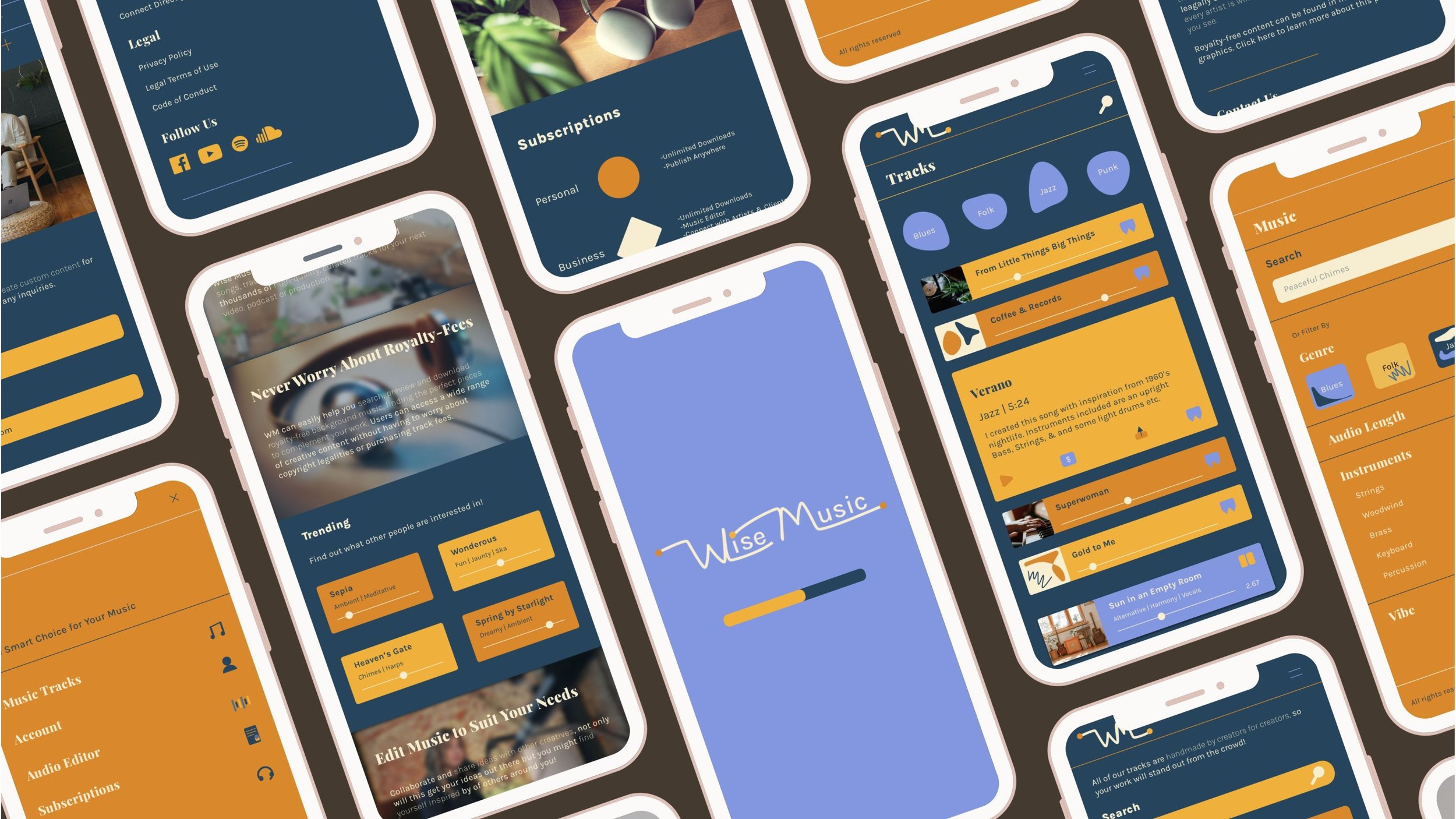
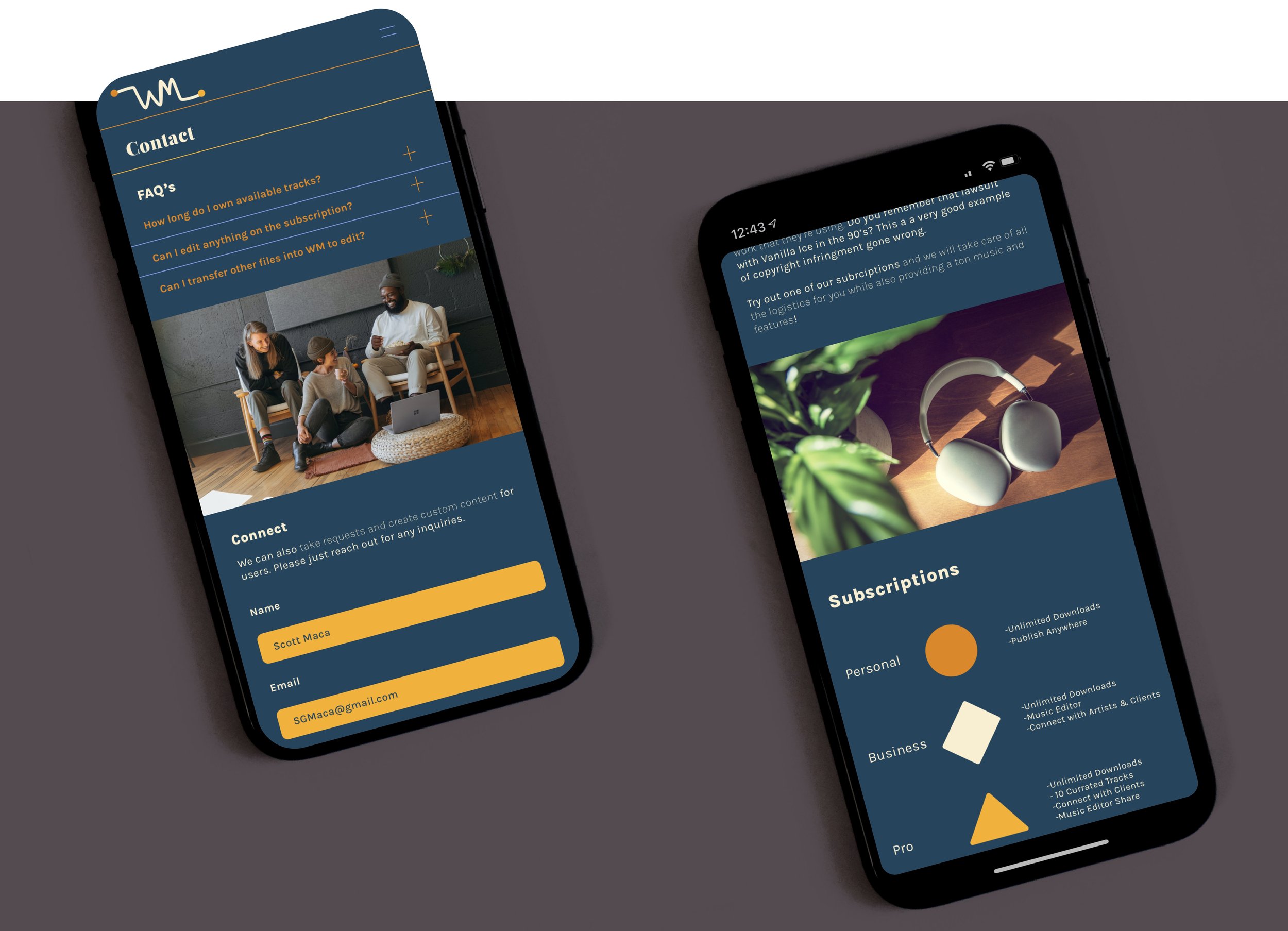
Wireframes & Mockups
Wireframes are often referred to as the original blueprints or bones of the site. For those unaware, each set of frames strategically ranges in design, taking everything in segments. To focus more on certain aspects here and set others aside there. You will find various improvements with every iteration (Low-, mid-, & high-fidelity). Then, our high-res mockups will help us bring those designs to life, as shown just below.
Low- Fidelity

The initial ideas are drawn out on paper, so we can thoughtfully consider the structure of each page. This step essentially organizes our content & layout before implementing finer design details like color & typography.

Here, you might notice that the app was designed with a mobile-first approach, as this is most likely how users are to come about the information. It’s important to focus the majority of our attention on certain types of designs, and then expand later.

Even during this initial wireframing stage, a few pages just never really felt right (i.e. graph and blog). I needed to find some way to meet both the client and user needs, I just hadn’t quite put my finger on how to do that yet…

Mid-Fidelity
Now I can create more thorough designs by bringing them online. Here we focus on alignment and implement a bit of copy. The frames you see below were created in through Apple’s Sketch program.


The Responsive Design


High- Fidelity
The high-fidelity frames start to showcase the visual style that was presented earlier in this case study (color palette, imagery, iconography, etc.). It’s important to remember UX/UI Designers take their time with each section so that we may create a mindful product that best suits the needs of everyone involved. Below, you’ll find is the second version of three.


I eventually decided to scrap a few pages (Graph, About, & Blog). Instead I set up a track editor for subscription users. While it may differ from the site’s original concept, this felt like actively useful architecture that better organized the brand and allowed users to really interact with the program.
Now, most music apps could just upload an artist’s album cover art and call it a day. Yet, I realized this might be an issue considering the majority of the content here is created by the site’s owner (and now the app's users).
I was actually inspired by the grocery company, Thrive. I decided that I could just create simple yet cohesive abstract illustrations that users had an option to apply when mixing tracks in the app.


Outcomes & Lessons
Well, there you have it -- All of our project goals have been accomplished and I feel like the UI design turned out pretty cool! I found this process led me through quite a bit research surrounding music technology, which I thought was facinating. I also appreciated an opportunity to practice more of our Gestalt Design Laws and Principles. Last but not least, I came across a few unusual issues during the project, which I believe helped me to become a better problem solver.
If you have any feedback on this design or would like to collaborate on a project, please inquire.
Thank you :)